Overview
Crux’s mission is to help companies ingest, validate, clean, and store data efficiently and easily. Crux offers a suite of data related digital products for both non-technical consumers, and highly technical providers of data.
The Challenge
When I started as the Lead Visual Designer at Crux, there was a contrast between the company’s mission to make elegant, easy to use data products, and the existing visual design, which was driven by only 2 colors, hard edges, ambiguous and inconsistent UI elements, and flashy, non-intuitive animations. The CEO and VP of Product both let me know that it was a top concern to improve the visual design system across all products that the company created. They wanted Crux’s visual design to feel modern, elegant and on-brand.
Goals & Objectives
I felt that I would succeed as a visual design leader by achieving the following:
Create Brand Guidelines and an extensive Style Guide to serve as a framework for future product additions.
Collaborate with the Development team to turn the Brand Guidelines and Style Guide into a thorough and exhaustive component library in Storybook.
Update the UI to immediately elevate the look and feel of all Crux products to be modern, clean, effortless to navigate, and accessible to users with a wide range of needs.
The Process
I began my visual redesign efforts by interviewing every person that I could from the CEO to Product Management, Marketing and Product Teams. My suspicion that the current visual design was belying a very sophisticated and elegant tool was confirmed based on their feedback.
I asked everyone that I talked to who they saw our customers as being, what they felt those customer’s needs and expectations were, and learned what other types of software and systems those customer used during their work days. Equipped with a brand vision and a clear understanding of our customer base, I got to work creating a visual brand that met the high standard of the products offered by Crux.

I created these personas to understand the various customers that would be using Crux’s suite of products before diving into the brand’s visual design.
Color Choices
Once I was equipped with an understanding of the folks who would be interacting with Crux’s products, I used that information to inform color and style choices. I wanted to show these product users colors, fonts and user interfaces that would feel familiar, yet exciting. Accessible, but not not boring.
I also wanted to make sure that the colors we settled on aligned with the company’s product values. Piggybacking off of the work that a 3rd party marketing consultancy had recently done for the firm, I made sure to align the desired and espoused values that stakeholders from Crux had in the brand with the colors and styles that I chose.

Brand Guidelines: new brand colors chosen based on what key stakeholders felt the brand should convey.
I presented my color suggestions to stakeholders, giving them a crash course on color theory and how choosing the colors proposed could help to subtly increase our user’s trust in Crux’s products.
Once the colors I presented were approved, I set out to create a more complex color system that would include all colors to be used in all Crux products. These included colors for:
Buttons
Text
Warning, error, and success alerts and states
Tags, Avatars and Charts
Illustrations
Marketing materials
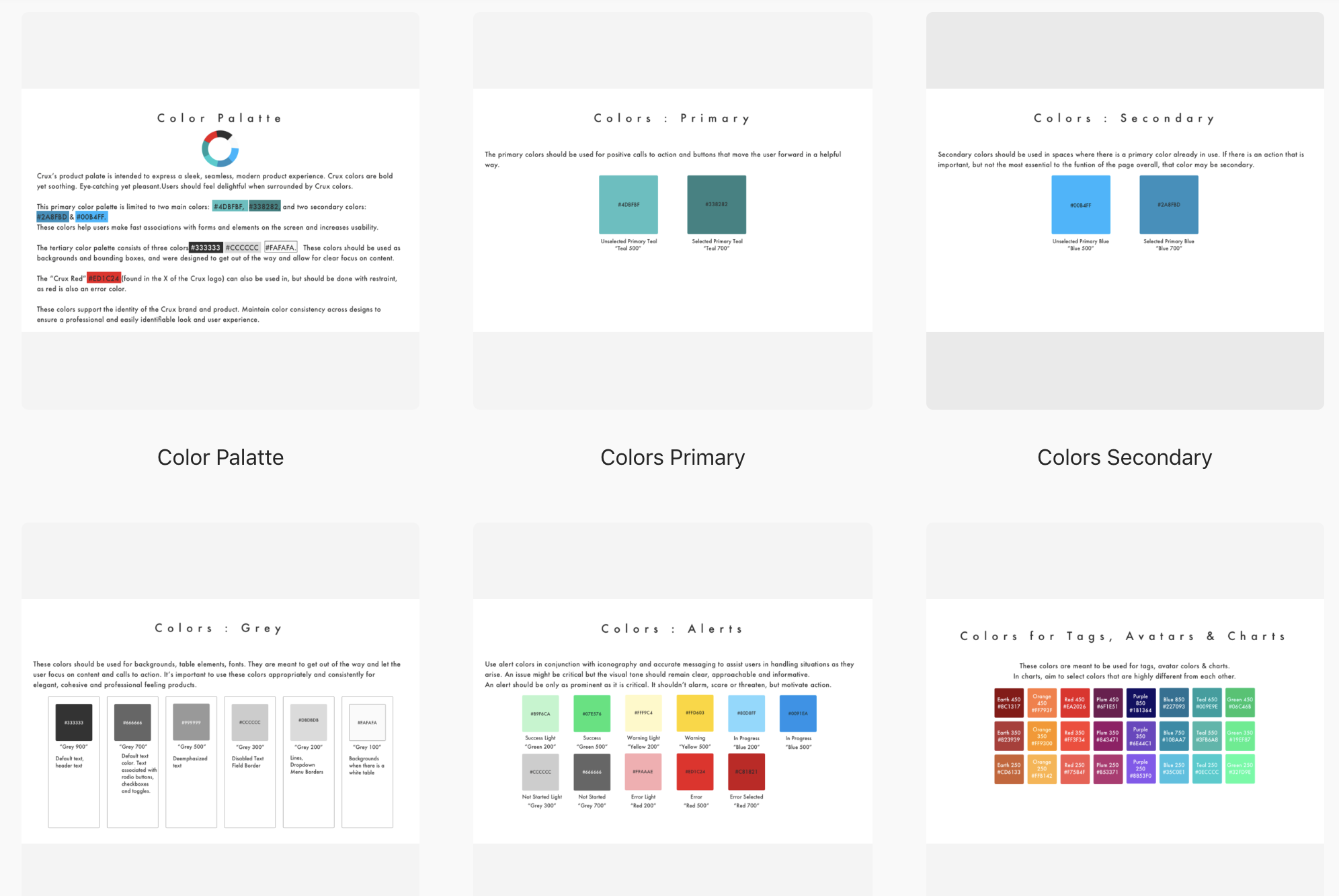
An inventory that includes all brand colors for with Hex codes for designers and names for developers.
Brand Guidelines
I also created high-level brand guidelines and basic visual principals to be used by Sales and Marketing teams to ensure continuity across products and presentations.

Brand Guidelines: downloadable logos in multiple formats

Brand Guidelines: clear space rules for logo placement

Brand Guidelines: Logo best practices
Having established some basics, I set out to create a much more comprehensive style guide to dictate the look and feel of everything created by the company. After obsessing, aligning, pixel-pushing, and generally having my screen zoomed in to 800% then zoomed out to 25%, I’d amassed an exhaustive 150 page style guide. It addresses every element of the look and feel of all Crux products. This covers everything from typography and color rules, to grid spacing, error states, menus, tabs, widgets, navigation, search fields, and thousands of little details in between.

Style Guide: Thumbnails of 9/150 pages.

Style Guide: Thumbnails of some of the font rules for weight, hierarchy, headline and body spacing.
What’s it all for? Making the Style Guide useful beyond the Design Team
I knew that teammates outside of the design department could logically wonder who might actually use a 150 page style guide aside from the design team. But I was confident that the style guide was important to have and knew it would save lots of time for both product and development teams.
To increase the usefulness of the style guide, and to ensure that the rules laid out in it were being followed, I set up weekly meetings with the UI Development team to turn elements of the style guide into reusable components (including widgets, font, color sand elevation systems) for developers in Storybook.
“Storybook is a user interface development environment and playground for UI components. The tool enables developers to create components independently and showcase components interactively in an isolated development environment.” - from https://storybook.js.org/docs/basics/introduction/

Dropdown component from the Style Guide.

Dropdown component from Storybook.
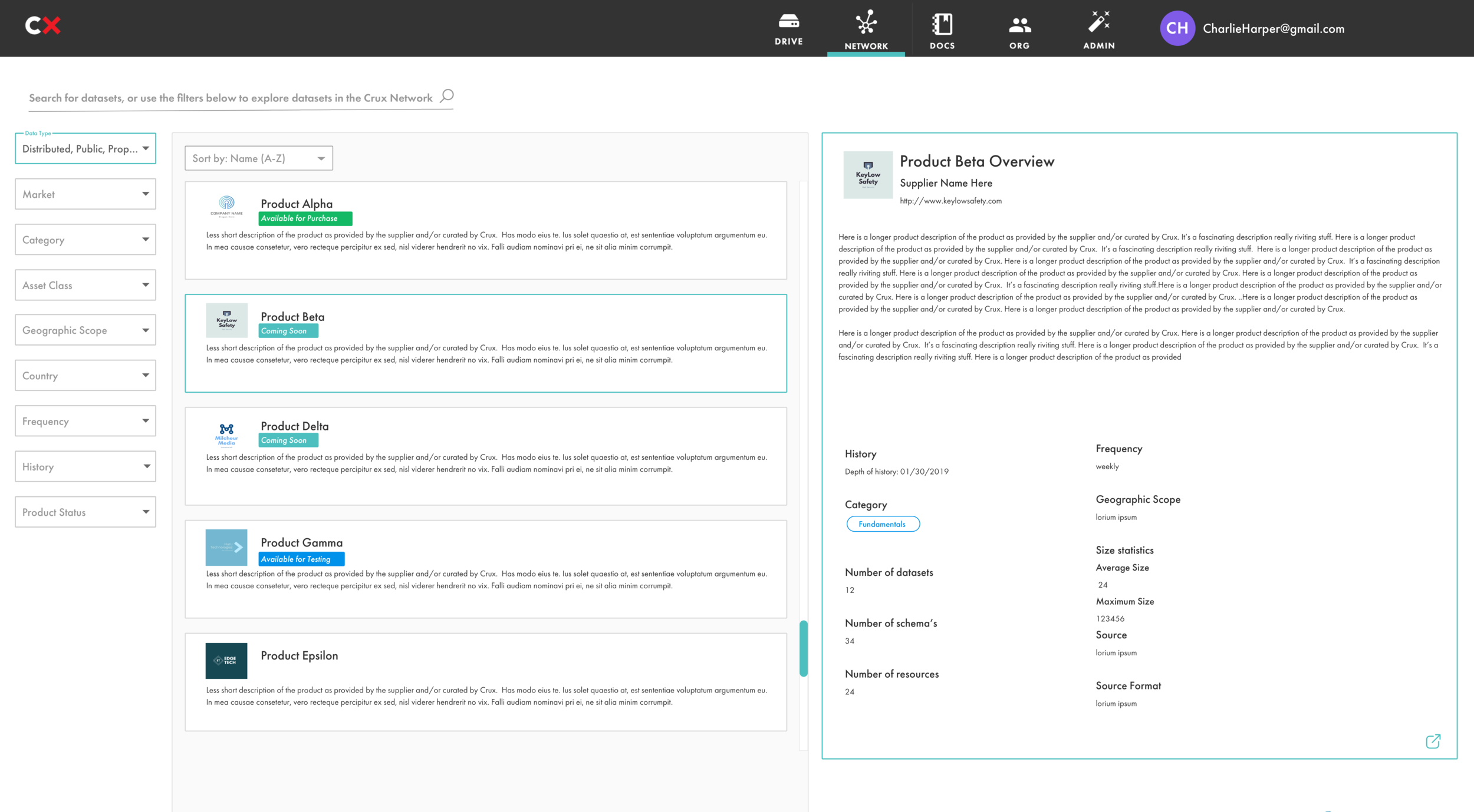
The work done in these meetings was put into the Crux UI Kit, a robust set of UI components that allowed the UI team to rapidly increase their speed of development.
Results
The design system worked! Developers were happy to have a component library to automate their workflow, and after a few weeks using the new UI kit, 2 senior members of the team were freed up to work on more complex projects. Everyone was working faster and doing less busy work, and the senior team members got to focus their skills on growing the set of tools that Crux could offer our customers.
The style guide and component library ultimately helped to build out a number of internal and external tools and interfaces in a very short period of time.